Rebranding Bantam Bagels
With a brick-and-mortar store in New York City and a deal on Shark Tank under its belt, Bantam Bagels approached Strong Studio to update and elevate its branding in preparation for a launch in supermarket freezer aisles and Starbucks pastry cases nationwide.
CHALLENGE
The existing brand lacked cohesion and an authentic New York City feel. Multiple packaging prototypes exacerbated brand confusion and failed to communicate the superior quality of the product. A complete brand overhaul was needed including logo, packaging, website, and marketing materials.
The company’s prior attempts at creating logos and packaging failed to create a recognizable brand or communicate the premium quality of the product.
SOLUTION
Inspired by the classic bistro, I employed distinctive typography, graphic elements, and shapes to create a sophisticated mark that could be applied in a variety of formats while remaining consistent and recognizable across multiple product lines.
From inspiration…
…to sketches…
…to typography….
…to working with the design team to achieve a polished final logo.
Anticipating a variety of formatting needs, the logo family includes a horizontal logo and a shortened “BB” mark. And, the icon at the bottom of the logo provided an opportunity for customization across a range of products.
The color palette further evolved to include colors indicating each of the product flavors, as well as a bright blue and white palette for the more casual Bantam Pancakes product line.
The Bantam Bagels brand had to stand out in the freezer section and in a busy Starbucks pastry case (while still fitting within the established Starbucks look and feel).
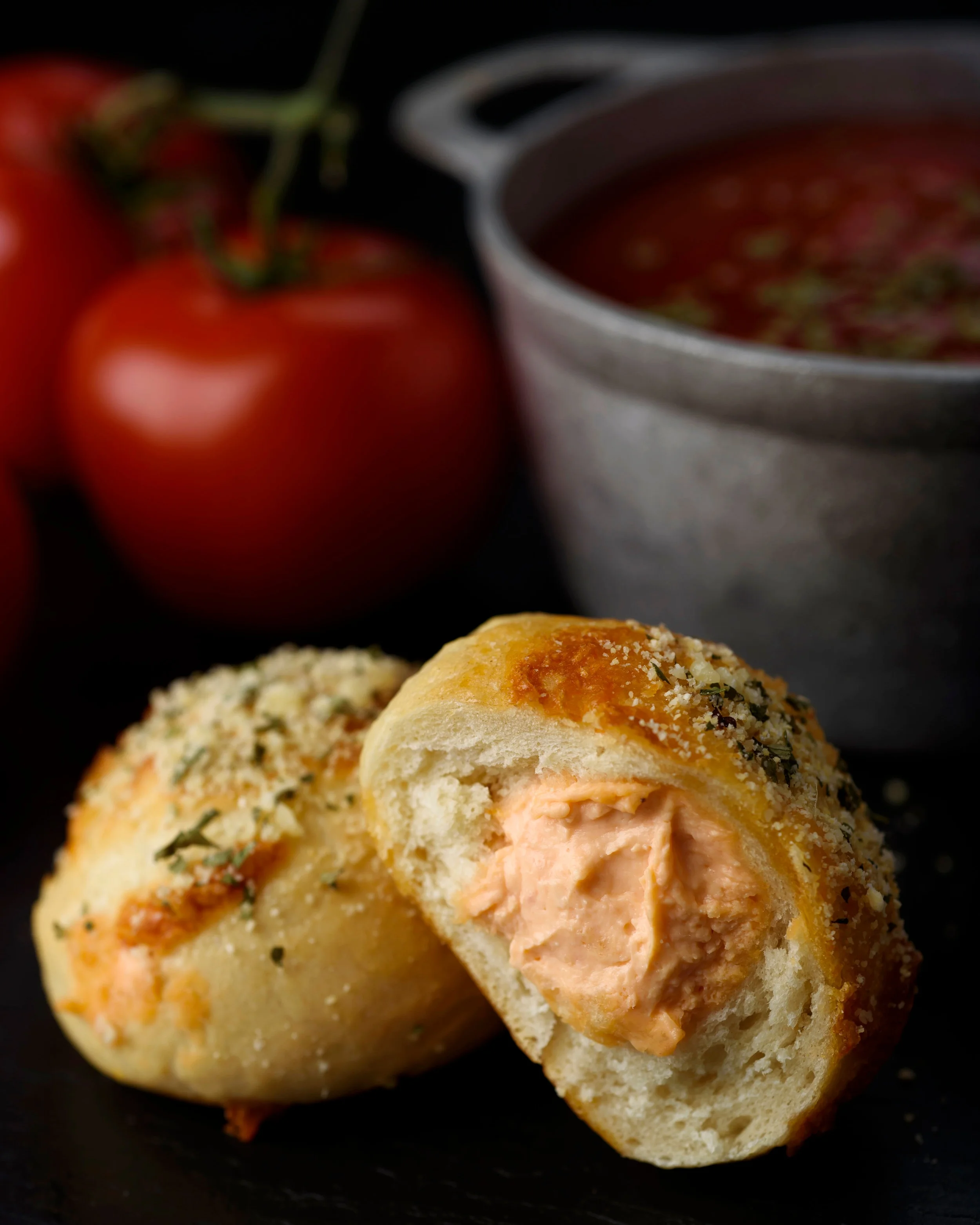
Photography Selection and Art Direction


